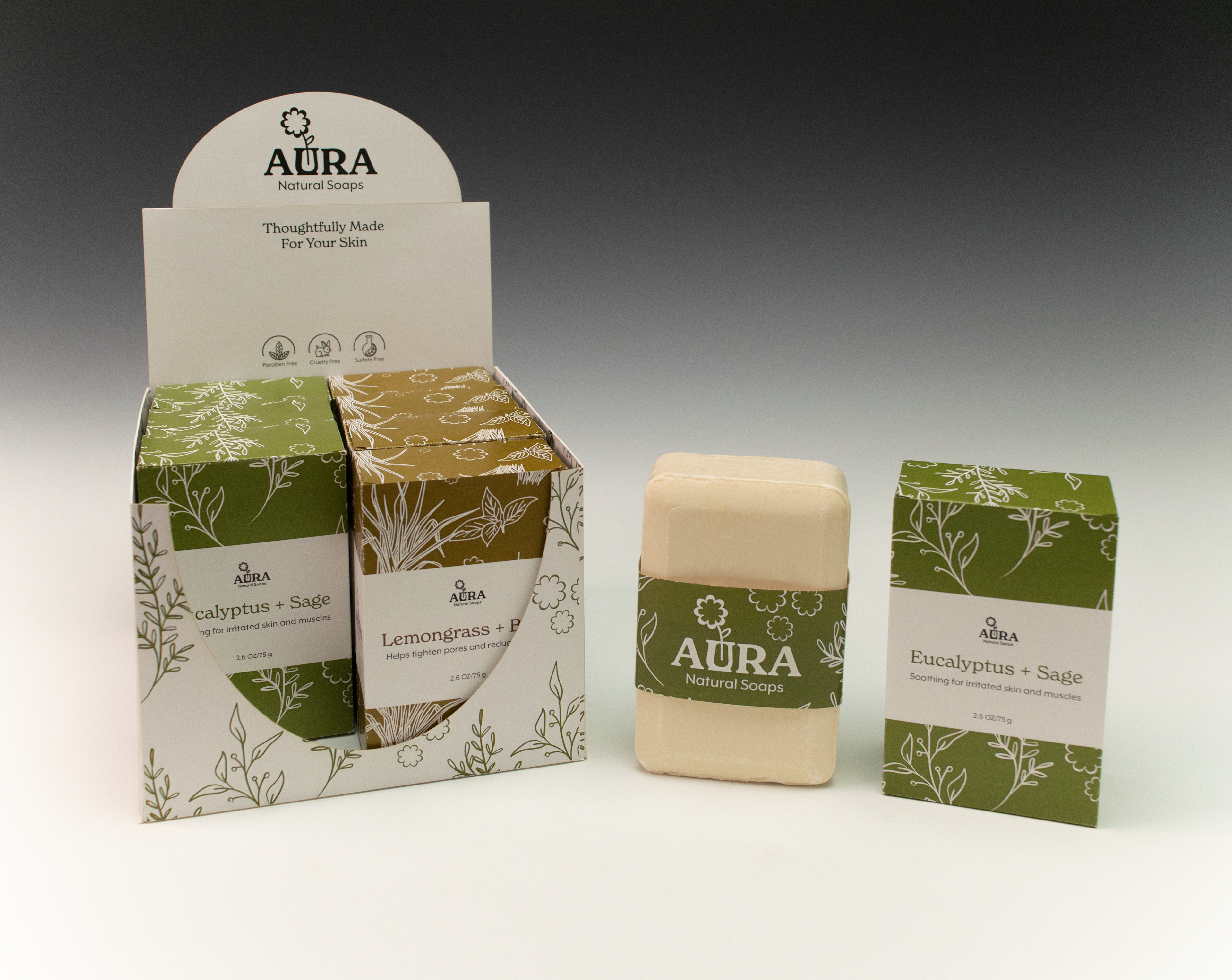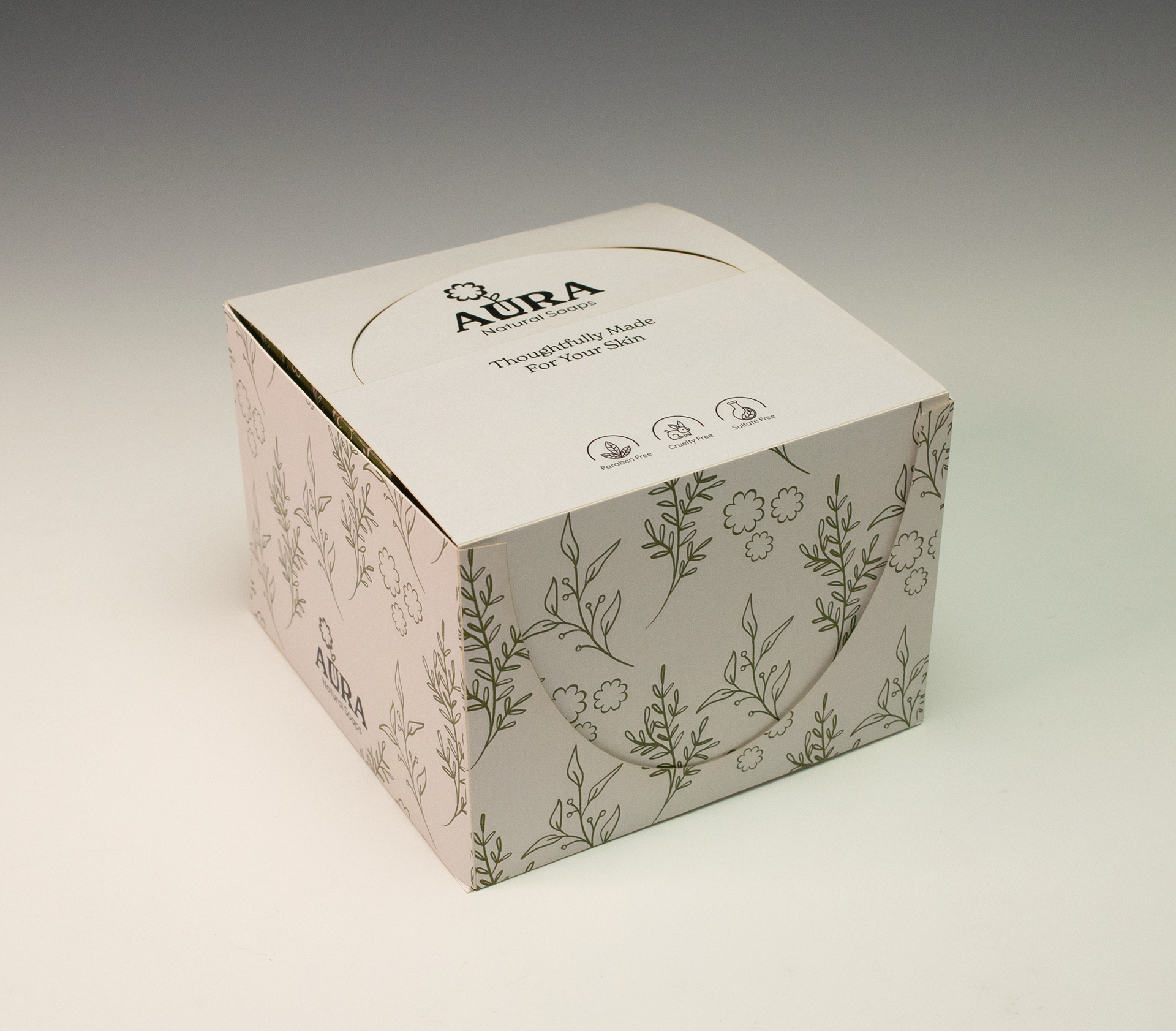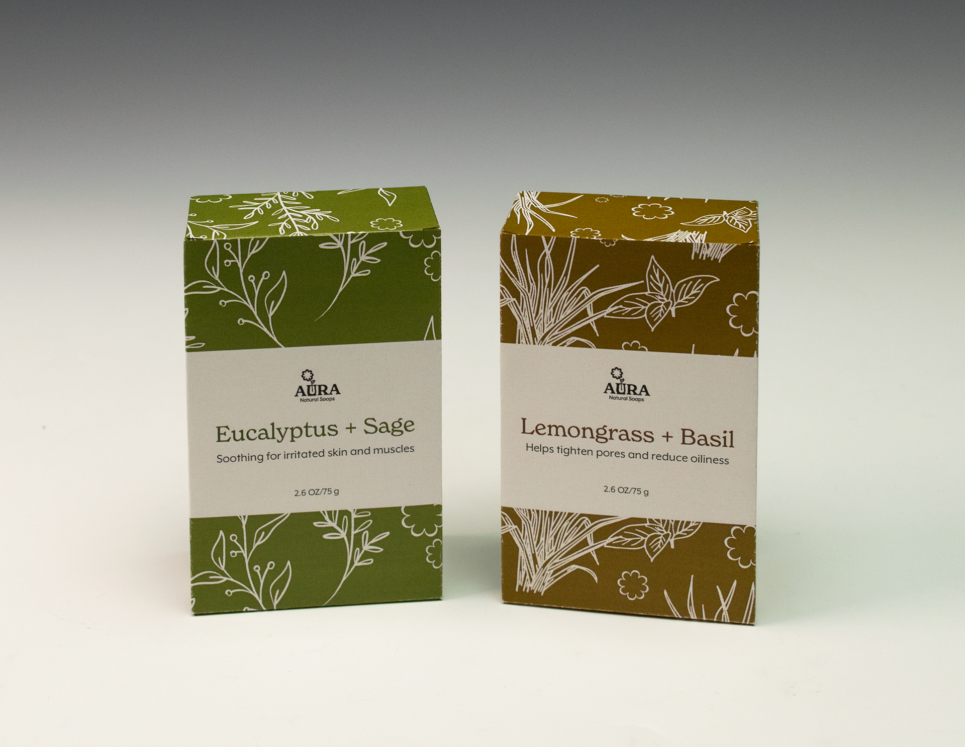

Packaging for a tuck-box and a Point of Purchase display for the soap brand Aura
Aura's brand identity is natural, clean, and friendly. This is evoked in the earthy color palette and friendly typeface choices. The audience for Aura is adults who are interested in clean beauty and sustainable products. Aura would be sold in farmers' markets and natural food stores. The packaging is clean and simple, making the brand seem reliable and safe. The pattern is delicate and informs the reader about the product's aromatic fragrances. The logo is approachable and reflects the natural aspect of the brand.